Well-drawn type has been integral to the Mac since the very start. Steve Jobs, who famously adored a calligraphy course in college, insisted that the Mac use “real” fonts, something made possible by the company’s early partnership with Adobe Systems. From 1984 through the present day, Mac operating systems have always let you use typefaces that look great—as well as those designed poorly, to be fair—but the features associated with type aren’t always well exposed.
Apple has over several years gradually, quietly added support for refinement available by accessing features in OpenType, the standard way in which font files are created for digital use. Cracking open the Fonts palette in Pages and other Apple software (as well as some third-party apps or their alternative controls) can let you make routine documents look a little spiffier and more legible, and add flourishes to ones that could use some pizzazz.
(By the way, a typeface is generally defined in modern days as the general appearance and characteristics of a set of characters meant to work together, across all its weights and styles, like Roman, oblique, italic, bold, extra-light, condensed, and so on. A font is the part of a typeface that you act on, whether it’s metal type from the letterpress era gone by or a font file that contains the digital outlines used to draw type onscreen and on printers.)
Not all fonts include OpenType extras, but many do. On sites that sell or offer high-quality typefaces, you can often find more detail about what features they include. Google has released its own free typefaces and distributes others through Google Fonts, where the description usually makes clear how built out the face is.
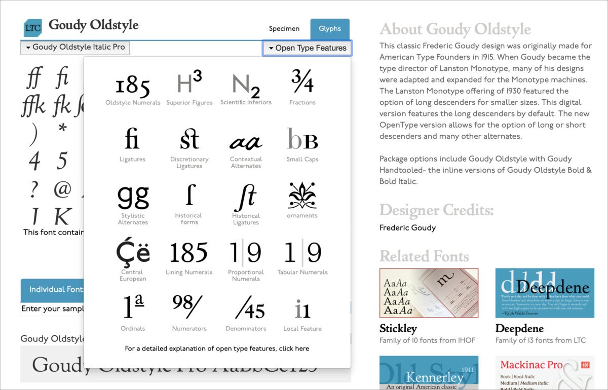
Some font foundries provide even more insight. P22 Type Foundry, for example, has a Glyphs tab for each font that lets you examine every character—known as a “glyph”—in each weight and style of its faces. But it also has an OpenType Features dropdown menu that appears if the typeface or particular font has any.
 IDG
IDG
P22 Type Foundry calls out OpenType features in some detail, as well as showing all glyphs in its fonts.
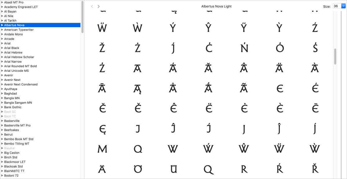
You can use macOS’s built-in Font Book app to see all the glyphs in installed fonts. Launch Applications > Font Book, click All Fonts in the upper-left corner, select the font you want to view, and then choose View > Repertoire. This reveals all the characters, including any alternative ones. Use the Size field (upper-right corner) or slider (right side) to see the glyphs at a larger or smaller size.
 IDG
IDG
You can see all the glyphs in a font using Font Book, built into macOS.
The Typography tool in Mac apps
The examples below rely on the later version of Pages for macOS. However, nearly any app in macOS that lets you use the Fonts selector (press Command-T to reveal or hide it) and select Typography from its gear menu in the upper-left corner should display the same results.
The Typography items are all based on the current selection of text. Make a change to any setting in the palette applies to the range. In some cases, you will want to select individual characters or small ranges, for instance to apply small caps (see below). In others, you can select your entire text run or make the change before you start typing to affect what follows—that’s useful if you want to use old-style figures throughout a document, as that setting only affects the digits zero through nine.
 IDG
IDG
Various kinds of letters and figures in typefaces are drawn against invisible lines, with curves dropping a little below and above them to correct for perception.
Lining figures versus old-style figures
Before charts and tables were common, nearly all numerals—called “figures” in typography—were upper-and-lower case and proportional. That requires a little unpacking (see figure above). Type appears on an invisible set of what are typically five horizontal lines:
- The baseline is where capital or uppercase letters “sit,” as well as the bottom of most lowercase or small letters and numbers.
- Descenders drop below that baseline, as in p, q, and y, to a common point.
- The x-height is a mid-point, the height of the lowercase letter x and roughly the top of most lowercase letters or their bowls (the rounded part of b, d, and h, for instance).
- The cap height is where the top of capital letters reach.
- The ascender is often slightly higher than the cap height, and it’s where the “ascenders” or long vertical strokes of lowercase letters, top out at as in f, h, and l.
 IDG
IDG
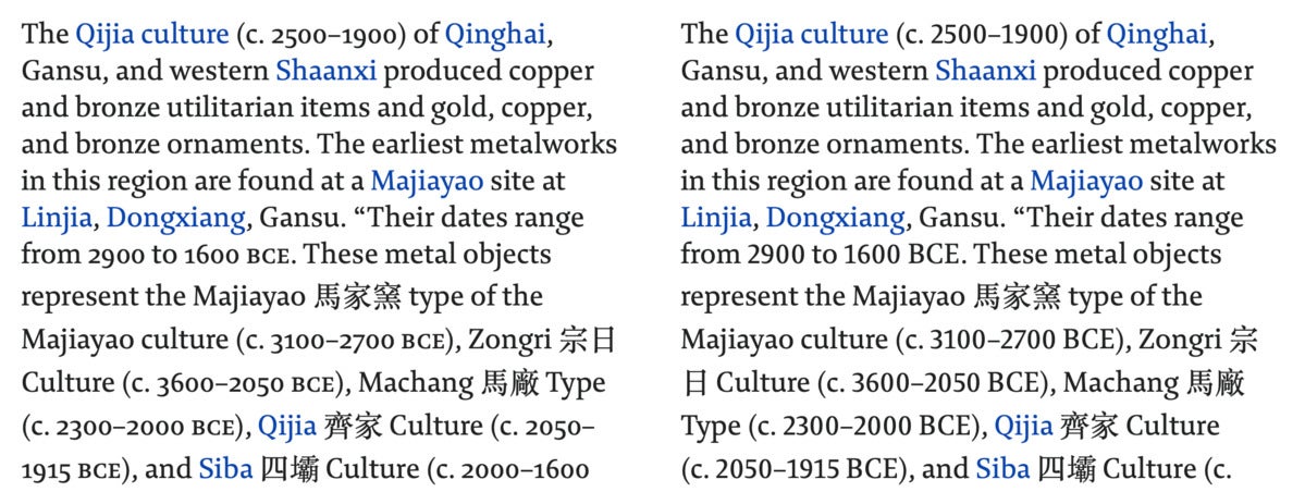
Old-style figures (and small caps for acronyms) fit the flow and “color” of text better (left) than lining figures.
Figures were designed originally to fit into text-like letters, and had a sort of lowercase look about them. The zero was a circle, like an o, though distinct; an 8 had its top bowl up at cap height; the 4 dipped its leg below the baseline. These are now known as “old-style” figures.
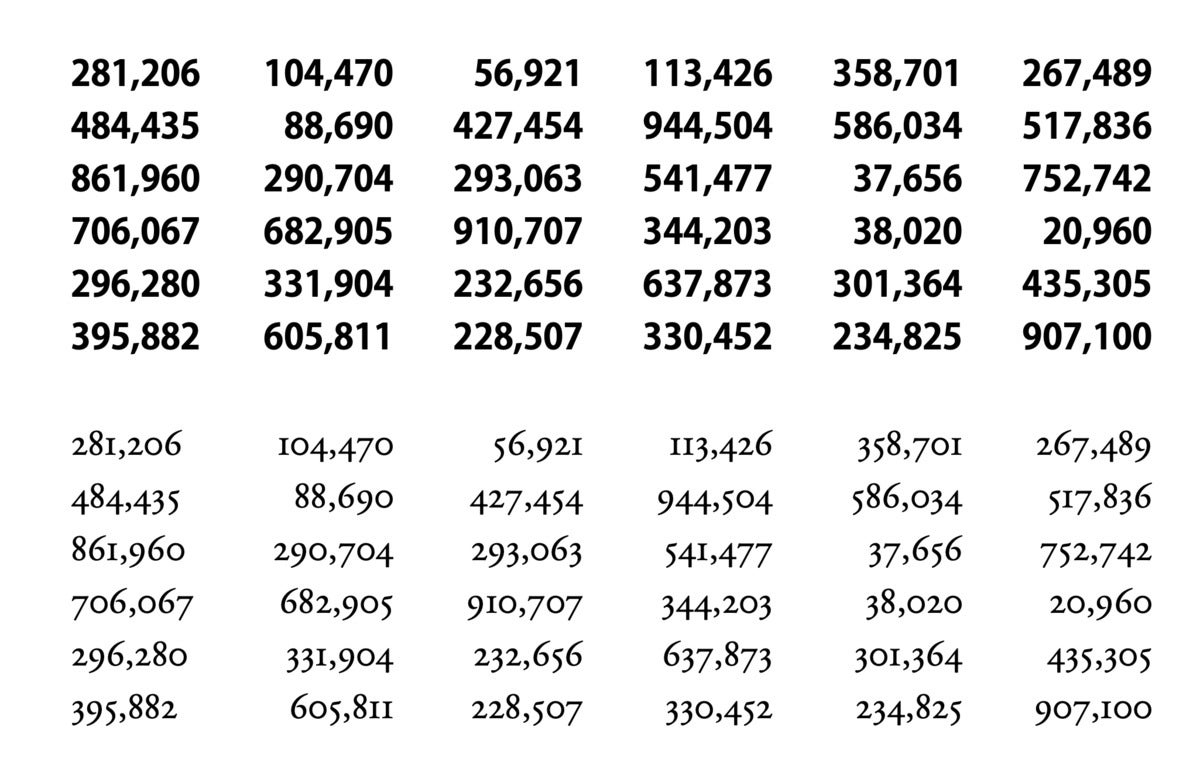
When you start using a lot of numbers for financial and statistical data, they need to line up to be understandable, otherwise your eye running down a column might mistake the 1,000s column in one line for the 10,000s in another. Thus came “lining” figures, which each take an equal amount of space to line up (monospaced) and which are all “uppercase,” occupying the same distance from the baseline to cap height. (There were and are old-style figures that are monospaced, too, but they seem fussy and aren’t as legible for scanning numbers.)
 IDG
IDG
Columns of numbers are far easier to parse with lining figures with monospacing (top) than old-style figures with proportional spacing (bottom).
Old-style figures became hard to find in the transition from metal to phototype and then into digital, because of the complexity of including them in limited fonts, and accessing them on dedicated typesetting hardware and early desktop-publishing software. They eventually came roaring back when fonts could contain arbitrarily large amounts of glyphs.
How to apply old-style figures: You can either select a range or select all the text in your document and use the Number Case section of the Typography menu: choose Old-Style Figures. This setting applies only to figures.
When to use old-style figures: In the middle of mixed-case typing, where there are relatively few numbers and they don’t need to line up.
When to use lining figures: In tables and charts, and anywhere people need to take in numbers at a glance for financial or statistical purposes. In all-caps text, lining figures look better, too, as old-style figures seem just as if you’d mixed in lowercase letters.
Small capitals or small caps
While you certainly know lowercase and uppercase, or capital, letters, you may have never heard of “small capitals” or “small caps,” which occupy a space between the two. Small caps were often used as a way to set off or emphasize text, including at the start of sections in books and articles, as well as to set acronyms without the awkwardness of a run of capital letters in the middle of mixed-case writing.
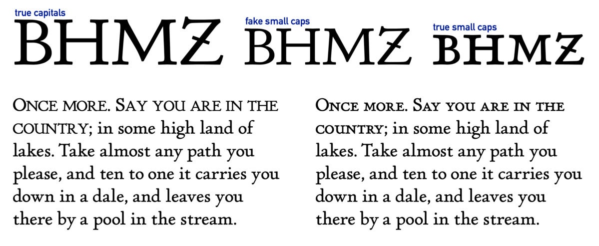
Historically, small caps were drawn separately, just like the upper- and lowercase letters. However, optical and then digital typesetting allowed capital letters to be shrunk and used as “fake” small caps, and most desktop-publishing and word-processing software let you select “small capitals” and would duly shrink the uppercase a bit.
But it never looks quite right, as the thicks and thins of these fake small caps don’t resemble the upper- and lowercase letters surrounding them! As digital typefaces added small caps to their repertoires starting decades ago (often in typefaces labeled as “pro” versions, and now in most complete fonts), software didn’t entirely catch up.
 IDG
IDG
Drawn or “true” small caps are noticeably better than the “faked” ones created by scaling uppercase letters.
For instance, in Pages, you can select text, click the Format button and then the Style tab, click the gear icon in the Font area, and then select Small Caps from the Capitalization menu. This creates fake small caps, even if the font contains drawn ones.
How to apply small capitals: Select a range of text and from the Typography menu’s Lower Case section, select Small Capitals. Any uppercase letters in the range will remain as full capitals.
When to use small capitals: To replace acronyms, including things like A.T.M., US-CERT, a.m., CD-ROM, and state abbreviations, like WA or CA. Traditionally, small caps were frequently used in lieu of lowercase in the first line of chapters in books.
When to avoid small capitals: Don’t use in long runs of text, as they’re not designed to be read at length, just as it’s hard to read uppercase for long periods.
Ligatures
You know that Johann Gutenberg likely printed the first book with letters that could be moved around and reused—so-called movable type. But you might not know that his studio produced over 200 different pieces of metal type to set his remarkable Bible. Beyond the 24 or so letters used in Latin at the time, punctuation marks, and numbers, what else did Gutenberg require? Ligatures!
A ligature is a combination of two or more letters that fixes ugly overlaps between them, or takes up less space. Gutenberg needed a pile of these to produce even left and right margins, and imitate the calligraphic writing of hand-scribed Bibles of the day. Metal typesetters needed ff, fl, ffi, ffl, and others to avoid the metal “kerns”—the overhanging bits of otherwise narrow letters—from getting crushed by adjacent characters.
 IDG
IDG
Ligatures change the flow of text, and reduce awkward character bumping. From top to bottom: no ligautres, modern ligeratures (ffi), historic ligatures (sh and ct), and ones that contain obsolete letters for modern prose (the long s).
But there’s still a reason to use them today: they avoid having extra white spaces between letters, and keep an even flow that aids in legibility.
OpenType lets designers separate out common ligatures, like ff and the like, and historic ones, like sh and ct, which were used frequently in the past but appear a little atavistic today. The former are generally useful; the historical ones, neat in particular contexts, but often distracting for modern readers.
How to apply ligatures: With a range or the whole text selected, select Common Ligatures or Rare Ligatures (or both) from the Typography menu’s Ligatures section. You can also select ranges of letters and deselect ligatures if you need a particular effect. Text with character spacing applies—as in Pages under the gear menu in the Font section of the Format palette—will typically override ligatures.
When to use common ligatures: In passages of text, always. In headlines or other forms, you may want to disable.
When to use historic ligatures: For particular projects, headlines, or other purposes in which the flourish makes sense.
Swashes and alternative letters
For display uses, like headlines and larger text, and drop caps, you might like to find an alternate to the regular characters in a font that are designed for legibility when reading passages of text. These swash and alternate characters can add a little zest, though they attract attention. If that’s what you’re looking for, they’re great! It’s tempting to use these everywhere, but that will turn your text into eye-piercing mush that your intended audience will ignore or find illegible.
One of the absolute best alternate capitals is Q, because it can be drawn in several styles, particularly in italic, and some typefaces like to offer a Q with an extra long tail stroke that will pass under one, two, or even more lowercase letters.
 IDG
IDG
Swashes, particularly capitals like Q, can add some variety and zest.
Because designers can choose to incorporate and label features in different ways, you may see different controls or have to experiment with the Typography menu to find what you want:
- Contextual Alternates: Some faces offer specific checkboxes. Adobe Garamond Pro, for instance, lists Swash Alternatives and Contextual Swash Alternatives.
- Alternatives: Selecting a character or range and then picking one of a number of different numbered alternatives may reveal excited options.
- Alternative Stylistic Sets (checkboxes by character): In Monotype Sachsenwald, a typeface designed for German Fraktur (a style that has much in common with “Gothic” or Old English faces), specific alternatives are called out by character. One or more options can be checked.
 IDG
IDG
Some fonts call out which letters have alternatives, making it easier to select those options.
- Alternative Stylistic Sets (checkboxes by number): Many typefaces list one or more items by number, which can be checked to overlay multiple different variations into the same range of text.
How to apply swashes and pick alternatives: The many options listed above will help. You can select as little as a character or an entire chunk of text.
When to use swashes and alternatives: For particular effect, such as in a headline or drop capital at the start of a paragraph.
"use" - Google News
December 31, 2020 at 06:15PM
https://ift.tt/380bHAY
How to make use of typographic refinement in Pages and other macOS software - Macworld
"use" - Google News
https://ift.tt/2P05tHQ
https://ift.tt/2YCP29R
Bagikan Berita Ini


0 Response to "How to make use of typographic refinement in Pages and other macOS software - Macworld"
Post a Comment